Menu
HOME
ABOUT
SCHEDULE
EQUIPMENT
HALL RENTAL
CONTACT
ACCESS
Upcoming Live
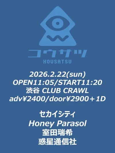
2026.02.22
SUN
OPEN 11:05 / START 11:20
「コウサツ」
セカイシティ/HoneyParasol/室田瑞希/惑星通信社
Adv
¥2,400
Door
¥2,900
2026.02.22
SUN
OPEN 18:30 / START 19:00
IrisaVior 1st ONE MAN SHOW ー蒼穹を引く-
チケットは完売しました
IrisaVior
Adv
¥4,000
Door
¥4,500
2026.02.23
MON
OPEN 11:30 / START 12:00
Shibu3 project 卒業式決起集会
Shibu3 project
前方チケット¥5,000円/一般チケット¥1,000円/当日券+¥1,000円
2026.02.23
MON
OPEN 17:00 / START 17:30
AND CaaaLL定期公演 『CaaaLL Over vol.2』
AND CaaaLL
前方¥5000円/一般¥2000円/当日+¥1,000
2026.02.24
TUE
OPEN 18:00 / START 18:30
爽風紀×CLUB CRAWL 爽風紀 1st EP「朝が怖い」リリースツアー 「時に飼われている」 東京編
爽風紀/Navy HERETIC/AUBREI/モリオンガク/Rikka
TICKET ¥2,500/学生 ¥1,300
2026.02.25
WED
OPEN 17:50 / START 18:20
Risa Birthday Live-🈂️活パーティFINAL-
AKIARIM/新章 大阪☆春夏秋冬/てのひらえる/不感症ヘビ苺/僕には通じない
SPチケット¥5,000/前売り¥2,500 / 当日¥3,000
2026.02.26
THU
「CLUB CRAWL」×「名古屋HeartLand」pre. 「不易流行」
Kudos Vein/10k I a mE(名古屋)/BOOT A PLANET/and more……
Adv
¥2,400
Door
¥2,900
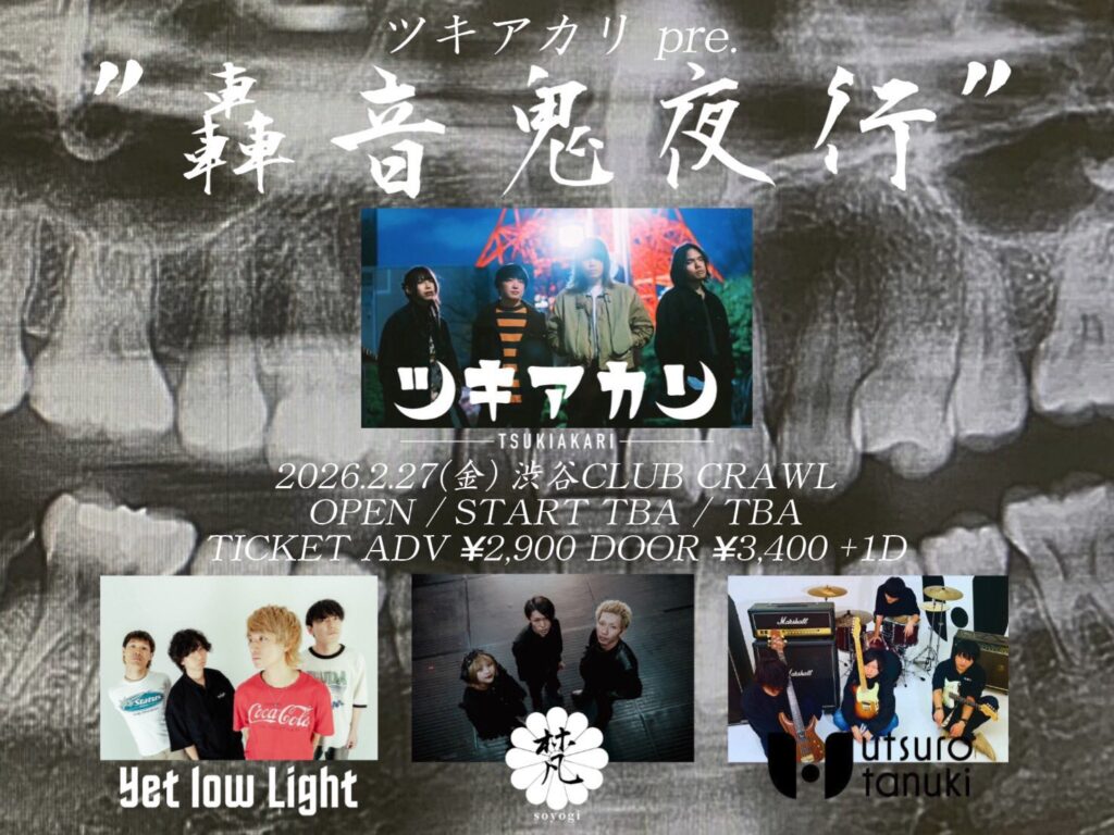
2026.02.27
FRI
ツキアカリpre. ” 轟音鬼夜行 “
ツキアカリ/梵/Yet low Light/utsuro-tanuki
Adv
¥2,900
Door
¥3,400
2026.02.28
SAT
OPEN 12:00 / START 12:30
goomiey pre. 「=」
goomiey/秘密兵器
前売¥3,300/学割¥3,000
Contact
Information